Wednesday, 29 April 2015

Claudia Hair Charts

As Ichthyosis impedes hair growth I thought it may be a good idea to design a hair chart where my model was wearing a bald cap, into which i had made holes. Id then pull thin small bits of hair through the cap to make it look like she only had clumps of very fine, dead hair.

I designed a hair chart were Claudia had a middle part and two plaits either side of her face, I thought this made her a little too girly and cute which isn't what I wanted.

This is the hair design I'm going to go with. Its a 1950's Victory Roll hair style. I think its best for Claudia because it shows that even through her condition she is just a normal 1950's girl. She does her hair everyday to make herself feel beautiful.

Claudia Face Charts


This is a face chart where I thought about making most of Claudia's face scaley using the fishnet tights method. I wanted to give her yellow contacts to really accentuate the lizard theme. However I thought this look was very flat and "expected" of an alligator woman.

On this face chart I wanted to make Claudia a little more glamorous. I stuck with the 1950's time and gave her a slight cat eye and deep red lip. Although I did like this I didnt think it represented her ichthyosis in anyway.

This is my final facechart. Im really happy with this design. Not only does she have 2D scales using the fish net tights method. I have layered this up by using Tissue paper stuck on with liquid latex to achieve a 3D dry skin effect. I think this is the idea I will run with. Im excited to see how I can produce this on the face.

1950's Victory Rolls

http://www.lipstickandcurls.net/blog/victory-rolls/

Victory rolls were a popular hair style in the 1950's. This is how I would like Claudia's hair to be to represent the time in which the television series she belongs to is set.  It would give the head more height and a heart shape which was desired around those times.
The Victory Roll is actually the name of a fighter plane manoeuvre which the ladies took and made it their own.


Tuesday, 28 April 2015

Claudia Moodboard


This is my mood board for Claudia.
I included a picture of Esther Blackmon as she was my initial inspiration for my character design. I also included a lot of alligator skin as this is the effect I want to achieve through my makeup.
At the bottom of the mood board I have the "Big Top" tent from a freak show. 
Down the side of the mood board I have my colour scheme for Claudia, browns, greens, reds and golds.

Development of Claudias Character

The Alligator Woman.
Claudia was born with a medical condition know as Ichthyosis Vulgaris and so her parents abandoned her.
She developed agoraphobia due to her appearance and distrust in people and so has stayed inside most of her life.
She feels she doesn't belong anywhere so has created an imaginary boyfriend Quentin.

Quentin helps to convince Claudia there is a place in which she belongs and this helps her get over her agoraphobia.
I researched old Victorian freak shows and the people that they used to display there. I found the alligator woman. I based my character Claudia off of this real life tale.
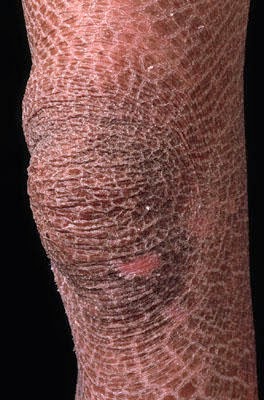
Ichythosis makes the skin appear scaly almost like an alligator
She was informed by her neighbour that there is a freak show in town. Claudia imagines that Quentin owns the freak show with Elsa Mars. This is somewhere she feels safe and that she belongs
Huffington Post (no date) Available at: http%3A%2F%2Fwww.huffingtonpost.com%2F2014%2F10%2F08%2Famerican-horror-story-freak-show-premiere-recap_n_5946260.html


I have chosen to use the word Veiled as inspiration for Claudia. I think this is appropriate for her character because she is disgusted by her appearance. She uses the safety of the indoors as a "veil" to hide her appearance from the outside world.
Available at: http%3A%2F%2Fwww.payvand.com%2Fnews%2F03%2Fdec%2F1089.html 

Experimenting with Scales

I do want to make Claudia's skin quite exaggerated and therefore not only am I going to use fishnet tights to achieve a 2D scaled effect, I want to layer over that with tissue paper and liquid latex. This should make the skin look like its so dry its falling off.

Needed;
Fishnet tights
Brown aqua paint
Black aqua paint
Red/Pink eyeshadow


Method;
  1. Stretch the tights over the area you would like the desired effect.
  2. Go over the tights with your aqua paint, to create depth add the black around the edges and to make the skin look painful add the pinks and reds.
  3. Carefully remove the fishnets trying not to smudge the effect you've created.
  4. you should be left with a scale effect.


I smudged these and so I learnt to wait for the paint to dry before removing the tights.

Needed;
liquid latex
Tissue paper 1 ply
Brown paint
Black paint
wound filler
Fake puss

Method;
  1. Apply the Liquid Latex to the area you want to attach the tissue paper.
  2. apply the single ply of tissue onto the latex in cut up pieces. The jaggedly the better.
  3. rip the tissue a little.
  4. paint over with the paints.
  5. Apply wound filler or fake blood.
  6. apply fake puss.

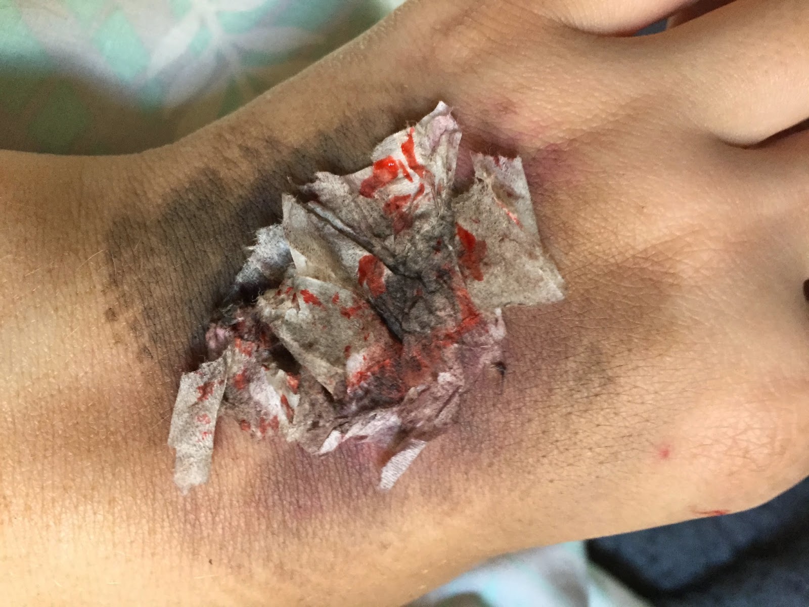
As I had no wound filler here I used fake blood, I will invest in wound filler as it will look a lot better.


Sunday, 26 April 2015

Ichthyosis

The NHS website describes Ichthyosis as; 
"Ichthyosis is a long-term condition that results in persistently thick, dry, "fish-scale" skin. There is no cure, but a daily skincare routine usually keeps the symptoms mild and manageable."
Lamellar Ichthyosis Arms Picture Image on MedicineNet.com (no date) Available at: http://www.medicinenet.com/image-collection/lamellar_ichthyosis_arms_picture/picture.htm

It claims that this usually occurs when a person inherits a faulty gene from their parent. If this is the case the symptoms will appear either at birth or within the childs first year.
"This faulty gene affects the rate at which their skin regenerates – either the shedding of old skin cells is too slow, or the skin cells reproduce at a much faster rate than they can shed old skin. Either way, this causes a build-up of rough, scaly skin."
Top 11 Doctor Insights on ichthyosis vulgaris (2015) Available at: https://www.healthtap.com/topics/ichthyosis-vulgaris

The condition can also be acquired as an adult, certain health conditions can play a role in the development of ichthyosis.
When looking at the pictures of examples of Ichthyosis its clear to see the colouring is mainly brown, this cracked, scale effect is what I want to achieve on Claudia. I will use fishnet tights to achieve the scales with brown colourings.

Choices, N. (2014) Ichthyosis - NHS Choices. Available at: http://www.nhs.uk/conditions/ichthyosis/Pages/Introduction.aspx 

The Alligator Skinned Woman


Esther Blackmon was born on march 5th, 1962. While the rest of her siblings were born with perfectly average skin, Esther was born with a condition known as ichthyosis.

According to one of her stylised posters, her appearance was due to her mother being frightened by an alligator while pregnant. In another, Esther was described as ‘baffled medical science’ with her condition. She travelled mainly withing the United States with West’s World Shows, Endy Bros. Shows, Cetlin-Wilson Shows, Royal American Shows and Clyde Beatty’s Circus Sideshow.
Ichythoysis is a rare skin condition that causes extremely dry and cracked skin. it also impedes hair growth. As a result Esther had no hair or eyelashes. The hairless and scales made her appearance unusual and the alligsator skinned woman began her exhibitation career.
I chose to use Esther Blackmon as inspiration for my Claudia design. I want to give Claudia ichthyosis and make her the lizard girl.

Pednaud, T. J. (2014) The Real Freaks Featured in the American Horror Story: Freak Show Opening Credits - Circus Freaks and Human Oddites. Available at: http://www.thehumanmarvels.com/real-freaks-featured-american-horror-story-freak-show-opening-credits/ 

Saturday, 25 April 2015

Research into Freakshows of the Victorian Era

During the Victorian Era, freak shows were very popular. Live human curiosities had been exhibited in travelling fairs, circuses and taverns in England since the 1600s. These included giants, dwarves, fat people, the very thin, conjoined twins and even people from exotic climates.  
The acts relied on shock and therefore the performers were not revealed in the flesh until the audience had paid and were sat down. This meant that publicity was curial and there for extravagant posters were used to lure the audience in. These posters often bared little or no resemblance to the performer themselves. Exaggerated and stylised illustrations aroused the curiosity of the audience by over playing the "freaks" they would see. 


British Library. (no date) Freakshow posters. Available at: http://www.bl.uk/learning/timeline/item106746.html 

I started to look at the sort of acts that would be present in freak shows and came across ones such as;
  • The bearded lady
  • Midgets
  • The Human Pincushion
  • The Elastic man
  • The lobster boy


Freakshow Influences on AHS Characters

Most of the character from American Horror Story; Freakshow are influenced by real life "freaks" from the victorian era. I was able to find some of the ones they took inspiration from.

Ethal Darling- The bearded Lady

Real Influence-Grace Gilbert


Meep 

KooKoo- The bird girl


The Tattler Twins- Conjoined

Millie-Christine - The Two Headed Nightingale


Jimmy Darling - Lobster Boy

Fred Wilson - Lobster Man


Pednaud, T. J. (2014) The Real Freaks Featured in the American Horror Story: Freak Show Opening Credits - Circus Freaks and Human Oddites. Available at: http://www.thehumanmarvels.com/real-freaks-featured-american-horror-story-freak-show-opening-credits/ 


Thursday, 23 April 2015

Moodboard For American Horror Story Freakshow

This is my TV Series Mood board. I have included images of characters from American Horror Story; Freakshow such as Jimmy Darling, the lobster boy. Elsa Mars who owns the freakshow and one of the most famous characters from this season, Twisty the clown. 
For the background of my moodboard I included circus tent stripes and blood as these are two main features throughout the show. 
I also included the "big top" tent of the freak show and the AHS Season Logo.

Wednesday, 22 April 2015

My Chosen TV Series- American Horror Story Freakshow

American Horror Story: Freakshow is the fourth season of the television series American Horror Story created by the American company FX. It first showed on October 8th, 2014 and ended on January 21st, 2015. 
Enriquez, J. (2014) Disturbing American Horror Story: Freak Show title sequence released. Available at: http://www.dailymail.co.uk/tvshowbiz/article-2777325/American-Horror-Story-Freak-Show-creepiest-disturbing-title-sequence-released.html 

The season is mainly set in 1952 Jupiter, Florida. It tells the story of one of the last remaining freak shows in the US and their struggle for survival. 
I chose American Horror Story because I've watched it from the beginning and I believe it is a real modern day Gothic horror.
Brasil, A. H. S. (2014) American Horror Story: Freak Show - Official Trailer - HD. Available at: https://www.youtube.com/watch?v=Gw1aarm2DuU 
Here is the trailer for the fourth series of American Horror Stroy
Audience Demographic
According to the press release, the Freak Show premiere “Monsters Among Us” brought in over ten million viewers total, with 6.54 falling into the 18-49 demographic.
These are new horror watchers as well as the audiences that have grown up with horror and aren't willing to let it go yet.

The shows audience is such a wide demographic because it offers something to everyone.
For the younger audience there are the love stories such as that between Jimmy Darling and Maddison Montgomery. for the older audiences there are the references to urban myths and actual freak show characters that they may have heard of before.


Tuesday, 21 April 2015

An Introduction to Claudia, Quentin and Mrs Laderman


Claudia
Claudia is a girl in her twenties. As a child she was left alone to develop with little parental guidance and through her relationship with T.V. movies developed an unhealthy relationship with Horror films, believing this to be the way life really is.

All the scenes take place in various parts of Claudia’s apartment, which is European in style with
a great deal of kitsch décor. She is agoraphobic and is kept in touch with the outside world by her neighbours who provide her with her every day requirements.  She models herself on a variety of girls often twisting her look to suit whichever film she is watching at the time and there is often
a nod to the main character in the current film within her appearance.

The script portrays her as psychotic and there is always the feeling that although her character is scripted/can be seen as humorous, danger is just around the corner.   However all this is normal to Claudia and she is of a cheerful disposition in this mad world of hers.

Quentin
Claudia has an imaginary boyfriend, Quentin, who is long suffering and a constant disappointment to her. They don’t live together but he visits regularly and they talk on the telephone if he can’t get in to see her. As he is part of her imagination his appearance changes to suit her mood. Sometimes he will be a David Beckham looking guy, whilst in another scene he will appear as a Pete Docherty type, Daniel Craig type or a Hollyoaks Babe. If she is having a bad day he will morph into an uncouth couch potato chav with all that brings with it.

He is as into the horror film genre as she and into role-playing to suit her whims and moods.
Claudia has a paranoid suspicion that he is constantly having affairs behind her back and keeps him firmly under her thumb, sometimes restraining him or keeping him prisoner in one of the rooms.

Mrs Laderman
Claudia’s neighbour in her 40’s. She alternately changes into a variety alter egos and is Claudia’s friend and confidant. Living in the apartment opposite, she was Claudia’s only link to the outside world. Although they are friends there is suspicion that Mrs L’, has designs on Quentin. In fact she has designs on Claudia.

I have chosen to create Claudia and Quentin.

Project brief

This project is one in which I can utilise my skills in design development and characterisation. Using references to Gothic Horror as inspiration, we were asked to design two proposed characters for a TV series intro – Claudia, Quentin or Mrs Laderman. TV series intro is a show opening conveying the essence of the production: title, cast, the tone, mood and genre of the programme. Claudia, Quentin and Mrs Laderman characters must reference Gothic and/or urban horror.
The character must conform to one of the following TV series'
  • The Walking Dead
  • American Horror Story
  • Dexter
  • True Blood
  • Bates Motel
  • Buffy the Vampire Slayer
  • Vampire Diaries
  • Penny Dreadful
  • In the Flesh
  • Being Human
  • Hemlock Grove
  • Hannibal
And I must pick one of the following key words for each character.
  • Special delivery
  • blue coat
  • hydro bath
  • white rose
  • glass prison
  • red rave
  • white rave
  • taste
  • bandages
  • fork
  • stitches
  • save us
  • hellevator
  • slipping
  • veiled
  • spinning
  • exam
  • the woods
  • spiral
  • awakening
  • door
  • face

Sunday, 19 April 2015

Unit Evaluation

I really enjoyed studying Great Expectations as it is a novel I wasn't familiar with. It really helped me understand a bit more about the Victorian era and watching the 2011 TV mini series helped me get an understanding of the hair and makeup of the time. It was especially interesting to see the stark difference from our previously studied Elizabethan era and the ways in which makeup was excessively used back then to see that Victorian women wore barley any makeup and those who did were seen as a much lower class and sometimes seen as prostitutes. 
I enjoyed researching the ways in which cosmetics were used back then such as "victorian hairspray" which really interested me. Delving deeper into the world of SFX when looking at theatrical ageing and cuts and bruises was something that I thoroughly enjoyed as it wasn't something I had ever done before. In fact I found it surprisingly a lot easier than it looks. 
When looking around me today its clear to see the Victorian influences in the Gothic architecture that surrounds us. Churches and Cathedrals mimic Satis house and that helped the project brief become a lot more relevant to me which really helped when I was lacking inspiration.
I think with a little more work my continuity could be really well delivered as it lacked in a few places on this project. however this could be solved by me taking a lot more photos throughout working with my model.
Overall I enjoyed this project and I feel the research I did really helped with creating my final looks and designs.

Estella Final Assessment


Friday, 17 April 2015

Estella Practice

The first time I practiced my Estella was a practical lesson in which we were asked to create two sides of our character and so I created a side of Estella before meeting her husband were she looks youthful and pretty. I also created a side of Estella after meeting her husband were she has been beaten, has a black eye, and looks tired and thin from stress and lack of sleep.


I really liked the way this turned out and it inspired my final face chart.

Products
Kryolan foundation
kryolan white pepper eyeshadow
Ben Nye Bruise Wheel
Vaseline
Kyrolan Shallot eyeshadow
Fake Blood
Black Pepper eyeshadow
Illamasqua Loose Powder
Illamasqua Contour Powder
Chive Blossom Eyeshadow Kryolan
Kryolan lip LC003, LC006, LC002

Method.

1. Prep the skin with Cleanser, Toner and Moisturiser. 
2. Prime the skin with Illamasqua Matte Primer, to even out the skin. 
3. Apply Kryolan foundation in clients colour, blending outwards into ears and down the neck using a buffing brush.
4. Set with Illamasqua Translucent Powder.
5. Contour the face lightly with Sculpting Powder Duo.
6. Apply blush on the cheeks.
7. Using the Eyeshadows, work White pepper all over the lid. Use Shallot lightly in the crease.
8. To the left eye apply the colours from the bruise wheel slowly building up the intensity. Line the left eye with crimson eyeliner. 
9. Add Vaseline to give shine/swelling to the left eye.
10. Work into brows with Anis/Pepper. 
11. On the left brow create a gap in the brow for two slits. create these using Shallot eyeshadow and fake blood. Apply Black shadow to create depth.
12. Apply mascara lightly over the eyelashes.
13. Create a few grazes on the cheek with a stipple sponge in some fake blood right on the cheek bone. 
14. Finish with a nude/light pink lip colour.

Monday, 13 April 2015

Estella Hair step by step

Products
Paddle brush
Tail comb
Hair elastics
Hair grips
Sectioning clips
Hair curlers
Dry shampoo
Desired decoration

Method
- Brush all of the hair using the paddle brush.
- Using a tail comb create a center parting.
-Draw a line with the tail comb, using the ear as a marker. Take the front two sections and section off.
- Create a U shaped section at the back of the head and create a high ponytail. 
- Curl the Hair in the ponytail.
-Twist these curls around the ponytail to create a full bun and pin in place.
- With the lower part of the hair, create ringlet curls in small sections. Face the tongs upward so they can be easily pulled out.
-Pin half of these curls to the ponytail to add fullness. Make sure the ends are still curled for decoration. 
- Split each front section in half creating four sections at the front of the head.
- Going downwards, curl the outer sections in one large curl and pin back to the ponytail.
- Split the two sections into three equal sections, and curl each. Make sure the tong is facing the back of the head and the curls fall forwards. 
- Lightly comb through each side to form them into one big curl.
- Bring the curl back towards the ponytail to create a wave at the side and height on top.
-make the curls transition by pinning a few up from the bottom.